ARCIC
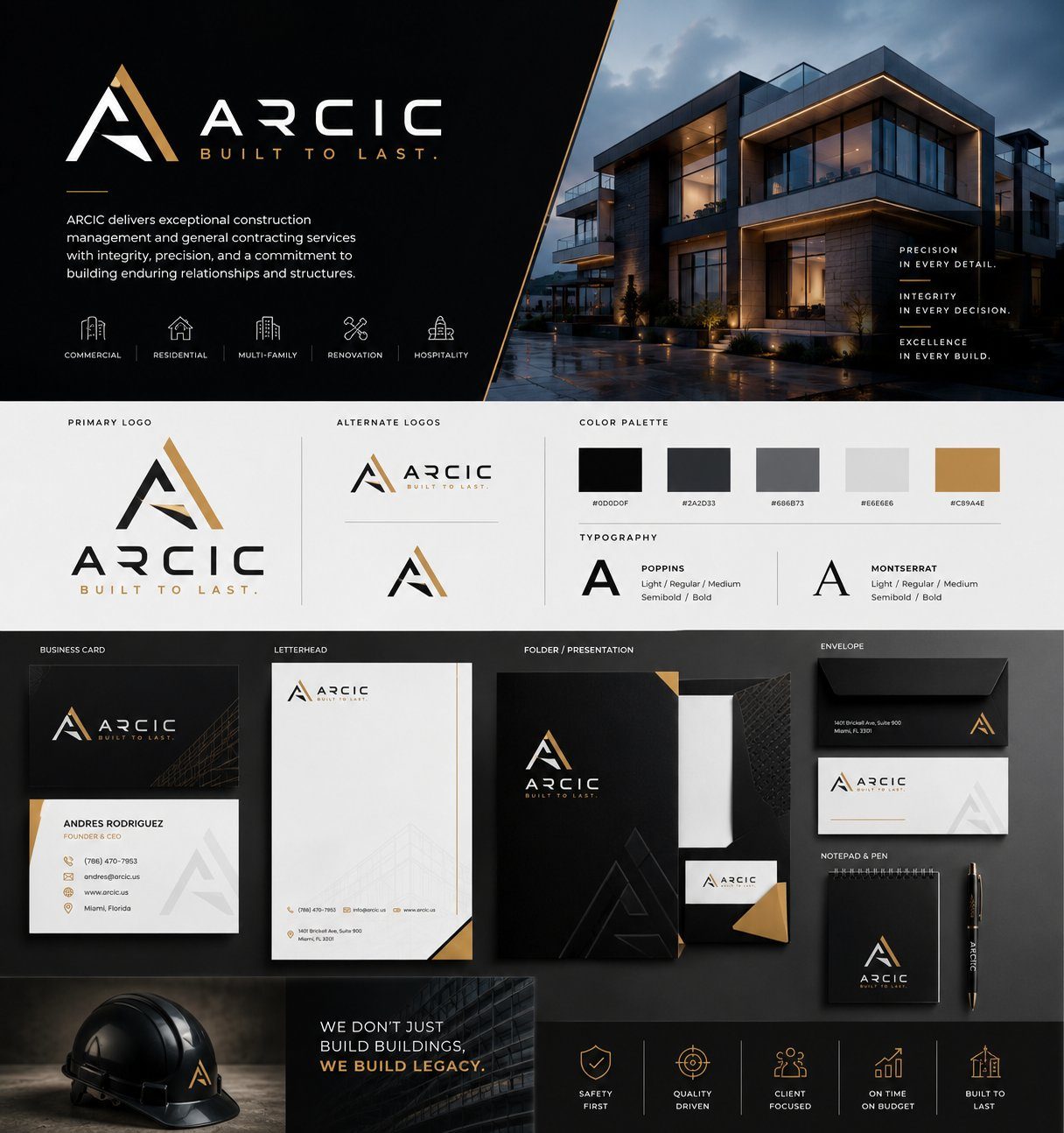
"Built to Last."
A construction management brand built on precision and permanence — a geometric A-mark in black and gold, carried across full stationery, signage, and site collateral.
Color Palette
Typography
Poppins · Montserrat
Identity. Strategy. Craft.
A selection of complete identity systems we've designed — each with its logo suite, color architecture, and typography engineered for the brand's market.
"Built to Last."
A construction management brand built on precision and permanence — a geometric A-mark in black and gold, carried across full stationery, signage, and site collateral.
Poppins · Montserrat
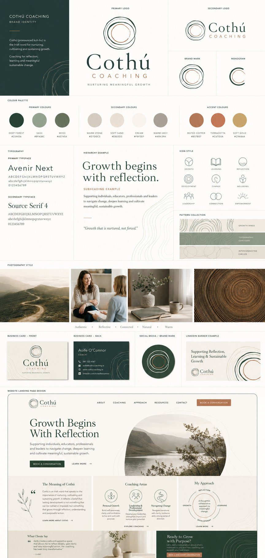
"Nurturing Meaningful Growth."
An organic, hand-drawn ring mark for a coaching practice — growth rings, topographic patterns, and an earthen palette that feels nurtured, not forced.
Avenir Next · Source Serif 4
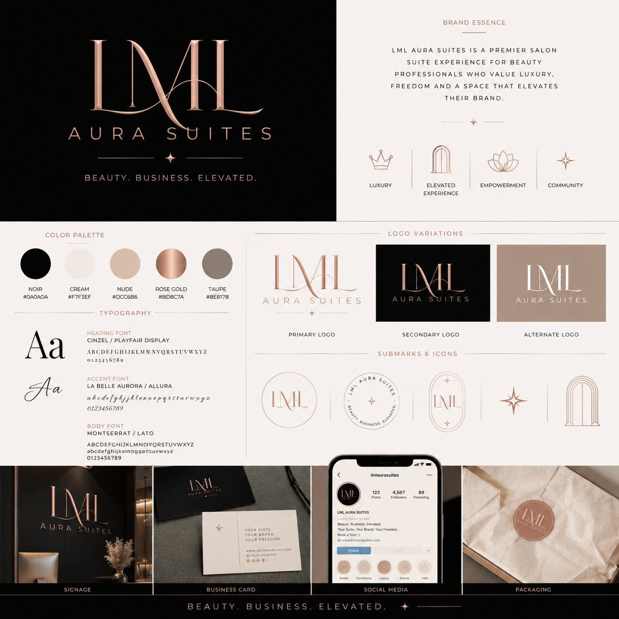
"Beauty. Business. Elevated."
A luxury monogram system for a premier salon suite experience — rose-gold serif lockups, arch and star submarks, and packaging that elevates every professional inside.
Cinzel / Playfair Display · La Belle Aurora · Montserrat
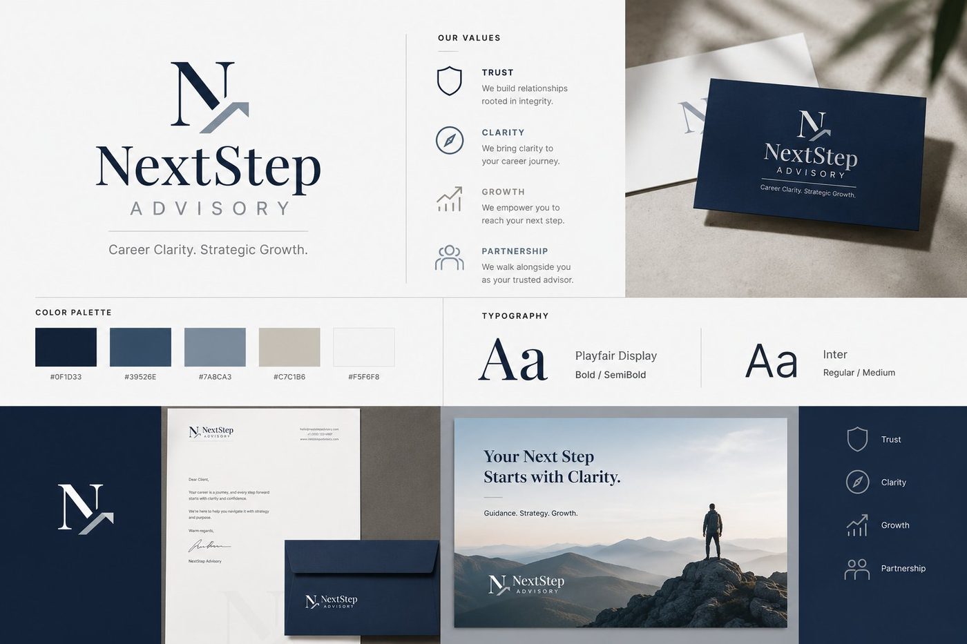
"Career Clarity. Strategic Growth."
A trust-first advisory identity — an N-mark with a rising step, deep navy palette, and editorial serif pairing that signals clarity and credibility.
Playfair Display · Inter
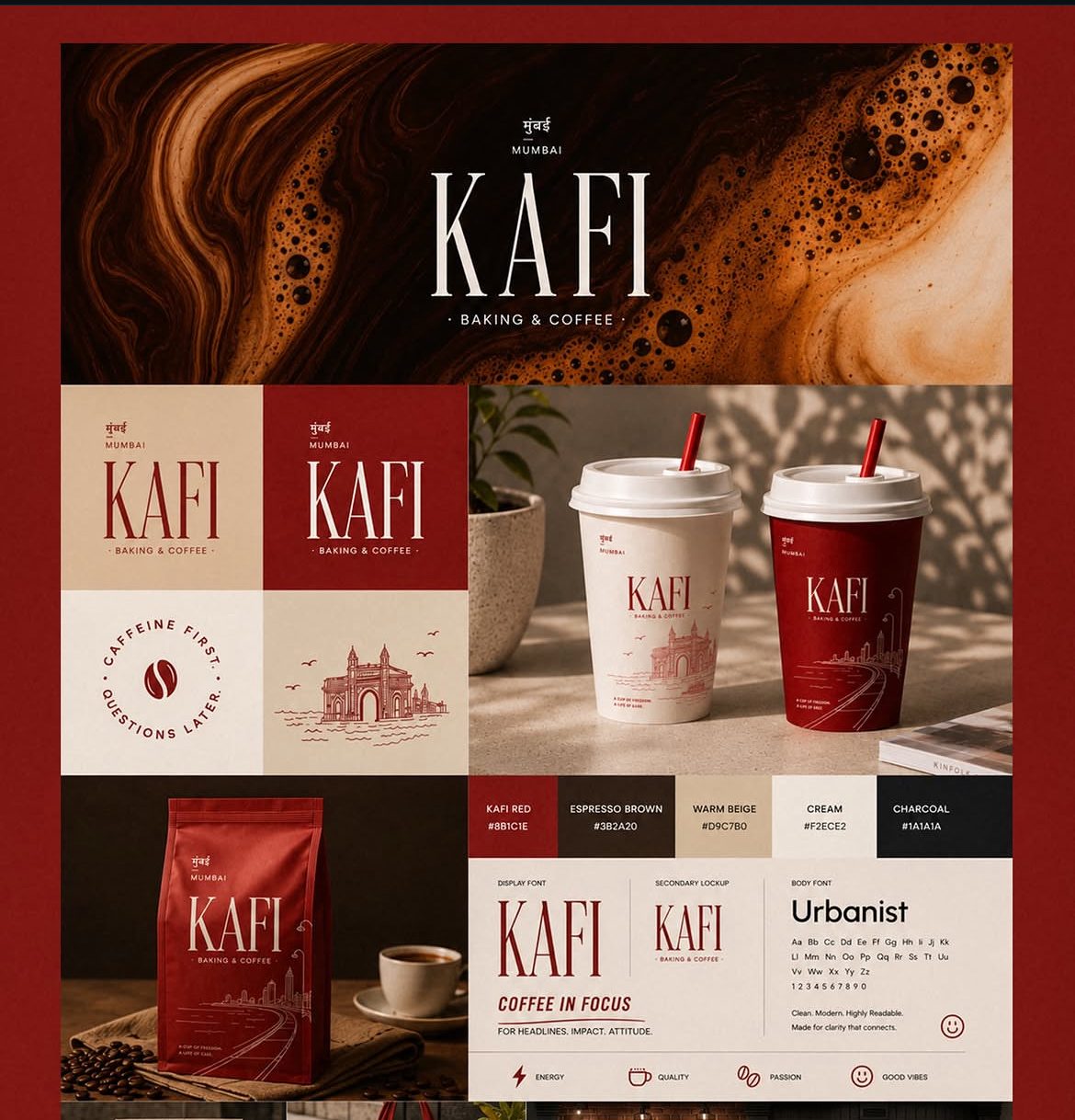
"Caffeine First. Questions Later."
A Mumbai coffee brand with attitude — a tall serif wordmark, Gateway of India line illustrations, and a red-and-cream system carried onto cups, bags, and badges.
KAFI Display Serif · Urbanist
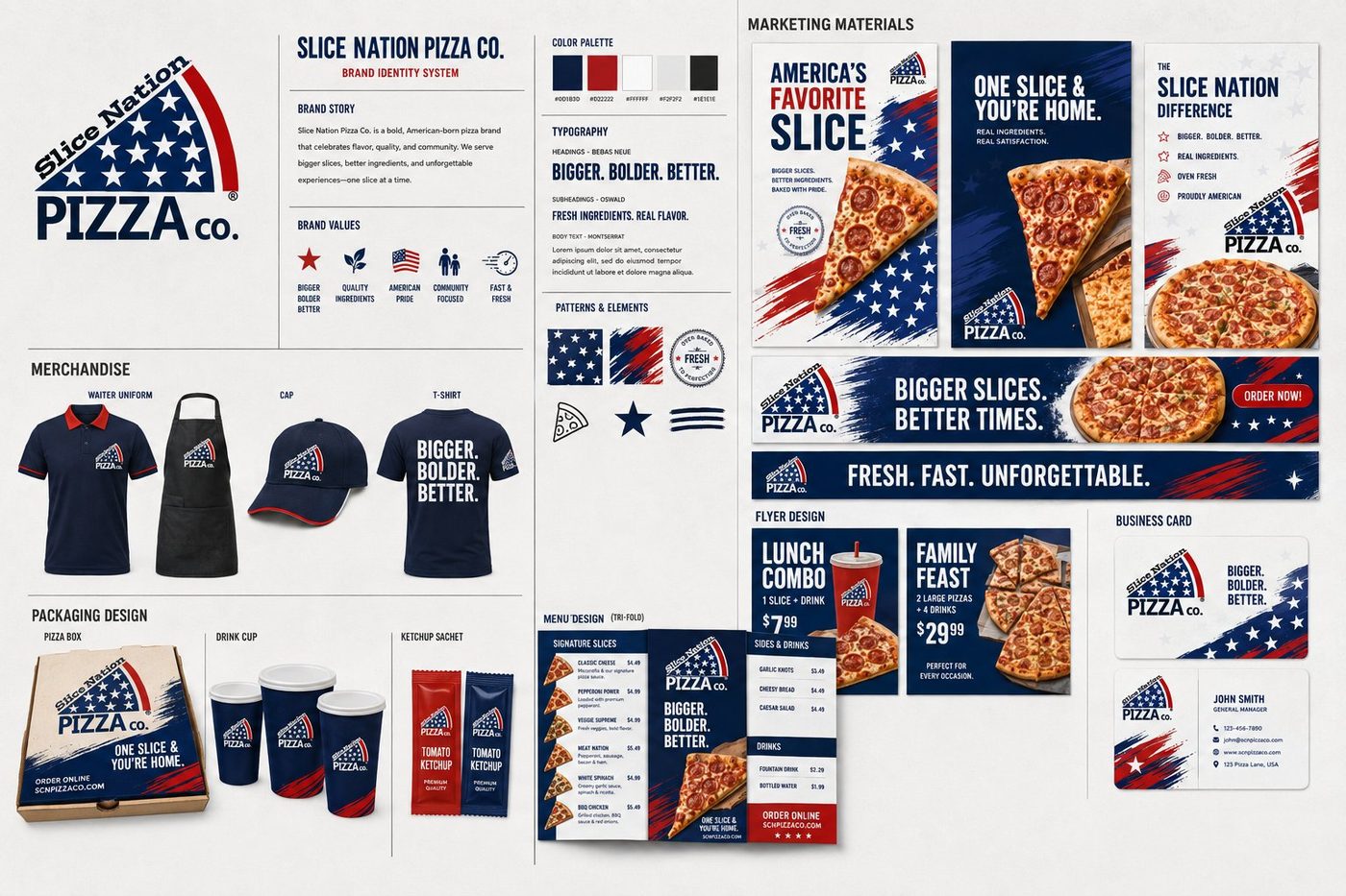
"Bigger. Bolder. Better."
An American-born pizza brand celebrating flavor and community — a stars-and-stripes slice mark deployed across packaging, merchandise, menus, and campaign material.
Bebas Neue · Oswald · Montserrat
Let's turn your digital presence into predictable growth. Book a free 30-minute strategy call.